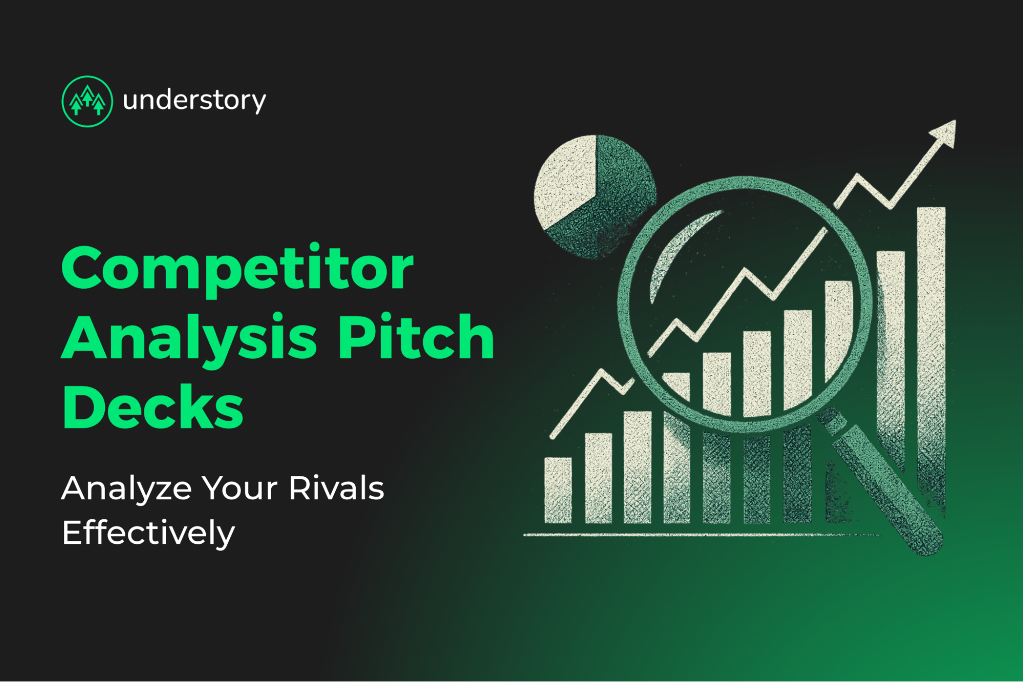
Your competition slide gets a brief window. Here's how to make every second count.
A weak competition slide can cost you investor attention before your second click. Investors review an entire pitch deck fast, so this slide gets only a small share of that time. Every element has to earn its place.
Most founders either clutter the slide with logos or make broad claims they can't back up. The harder part is coordination. If your positioning, design, and metrics don't line up, the slide feels off even when the product is strong. Understory helps SaaS teams turn that mess into clearer narratives through positioning, messaging, and pitch-deck support.
This guide covers how to choose the right competitors, what data to highlight, and how to design a slide that communicates advantage at a glance. Done right, your competition slide shows why you're built to lead the market.
What a Competition Slide Must Prove
Your competition slide has one job: show that you understand the market, know where you win, and can prove it.
A strong competition slide answers three questions clearly:
Who else solves this problem? Founders must address substitute behaviors and incumbent workarounds, not only named software rivals.
Why are we different or better? Expose feature gaps, pricing inefficiencies, or pain points others overlook. Then show exactly how you close them.
Why will customers choose us? Back your claims with data that prove your advantage is real.
Tell an investor you have no competitors, and they hear you have no market.
A vague slide signals risk. Omitting the slide is a common mistake.
Anchor your story on these three questions and support each with proof.
Identify the Right Competitors
Choosing the right competitors is where your slide either earns credibility or loses it. Separate direct, indirect, and emerging rivals clearly:
- Direct competitors solve the same problem for the same audience.
- Indirect competitors address the same need through a different approach, including manual workflows, spreadsheets, and the status quo. Customer inertia and switching costs are competitive forces, too.
- Emerging competitors are new entrants reshaping the market with new technology or business models.
In SaaS, separate tools that solve the same job directly from products that overlap indirectly through adjacent workflows. Emerging entrants can also change the competitive dynamic quickly.
Include enough competitors to show awareness without overwhelming investors. Each one should make your positioning sharper. If it doesn't, cut it. Don't ignore recently funded startups at similar stages. Investors notice when you only benchmark against incumbents and skip newer companies in your space.
Here's the honest part: competitor research is tedious, and many founders do it only superficially. They grab a few logos off a grid and call it done. That shortcut shows on the slide. Spend the time.
Use research to sharpen your positioning, not to create a bigger pile of screenshots. The point is to understand where competitors are strong, where they are weak, and where your story is easiest to defend.
Choose High-Impact Comparison Metrics
When your competition slide appears, investors immediately look for proof. They want to see where you outperform competitors and how that edge drives revenue. Focus on five metric categories:
- Product Capabilities: Show what your software does that others can't. Highlight up to three standout features and back each with documentation or verified user reviews.
- Pricing and Value: Demonstrate a clear cost-to-outcome advantage. Quantify savings or total cost of ownership benefits. Connect each dollar saved to improved customer margins. Skip vague "budget-friendly" claims.
- Customer Segment Focus: Clarify your ICP scoring. If your product serves mid-market fintech teams or specific verticals, say so. Segment mapping helps investors see where you win, not just what you build.
- Traction and Growth: Translate differentiation into momentum. Always anchor data in time. Real traction works best when it validates the competitive framing rather than leaving it as assertion.
- GTM efficiency: Prove repeatability. Highlight PLG funnels, channel partners, or CAC efficiency that signal scalable growth. The messaging investors see on this slide should match the messaging prospects encounter across your paid, outbound, and inbound channels. If those stories don't match, someone will notice.
Drop the vanity stats. Social followers and press mentions, while not the only factors, can help close funding rounds by increasing visibility and reducing information frictions for investors. Unit economics matter more.
Run every metric through three investor lenses before it earns slide real estate:
- Evidence Strength: Is the data verifiable?
- Strategic Relevance: Does it reinforce your positioning?
- Visual Clarity: Can it be understood in five seconds?
A real challenge for early-stage teams is finding verifiable data when you have limited traction. If you don't have ARR milestones yet, lean on product capability gaps and pricing advantages you can document. Don't fabricate momentum you haven't earned.
Only the top-scoring metrics belong on the slide.
Design the Slide: Matrix, Quadrant, Feature Grid
Three visual frameworks drive instant investor comprehension: the 2x2 positioning matrix, feature comparison table, and competitive map. Your choice of format should match your market context, not default to whatever template you saw first.
The 2x2 Positioning Matrix
This classic slide plots competitors across two investor-relevant axes, such as feature depth versus ease of deployment. It can work well when the market is still easy to parse and the axes are genuinely meaningful.
The catch is credibility. In crowded categories, every company places itself in the upper-right quadrant. In uncrowded markets, the 2x2 can still work well. In contested SaaS categories, it can become a credibility risk.
Feature Comparison Table
Ideal for product-led differentiation, this grid lists must-have capabilities in rows and competitor logos in columns. Use check marks or icons to highlight exclusive advantages. Limit comparisons to core features. Beyond that, tables lose impact and clarity.
Competitive Map
This approach visualizes competitors by market share and strategic focus. It can work well for showing traction against larger incumbents.
Back your market-share numbers with credible sources. Link third-party traffic tools or analyst estimates in the appendix.
Consider a Two-Slide Structure
A two-slide structure can work well: one slide covering the competitive landscape and customer alternatives, followed by a separate slide on competitive advantages. If your single slide feels cramped, split it. Give each argument room to breathe.
Design and Accessibility Principles
Most competition slides fall flat because the founder built the slide in isolation, disconnected from the broader deck's visual identity and messaging. Your competition slide's visual language should match the rest of your pitch and your GTM materials.
- Visual Hierarchy: Reserve your brand color for your data point. Competitor logos appear secondary. Three or four colors max.
- Legibility: Keep labels plain, with text at 18pt or larger. Maintain WCAG-compliant contrast ratios.
- White Space: Leave breathing room around each element. Cluttered slides look amateurish.
Nail these details and your slide does the talking.
Craft the Positioning Narrative
Your slide needs one positioning statement. One investors remember and repeat.
Use a consistent formula:
"Unlike [competitors] who [limitation], we [unique approach] to deliver [key benefit] for [target customers]."
This framework forces precision. It names your rival, exposes their constraint, highlights your differentiated method, and ties it directly to a benefit your buyers value most.
Simple contrasts work best when they clarify the buyer's tradeoff. Your wording should make the limitation, approach, and benefit obvious in a single sentence.
Apply the pattern to your approach. If you're pitching automated compliance reporting:
"Unlike legacy GRC suites that bury teams in manual audits, we use continuous monitoring to generate real-time reports, helping reduce manual verification effort for cloud-native fintechs."
Test every positioning statement this way: can the investor quote it back after the meeting? If not, simplify. Share the slide with someone outside your niche. After five seconds, ask them to repeat your advantage in their own words. If they can't, swap jargon for plain terms and trim until the limitation-approach-benefit pattern is unmistakable.
Build investor-ready pitch decks with Understory Agency
A clear, data-backed competitor analysis proves you know your market and can defend your edge. When your slide connects strong metrics, clean visuals, and a focused message, it works harder.
At Understory, we eliminate the coordination overhead of managing separate design agencies and positioning consultants. Our creative services include brand workshops for technical positioning, conversion-optimized pitch deck design, and consistent visual identity that supports B2B fundraising. Because we coordinate creative with paid media and Clay outbound, your investor deck aligns with the same messaging prospects see across your campaigns.
Book a call to see how coordinated creative, paid media, and outbound execution can sharpen your investor materials and your go-to-market.
Related Articles

Pipeline that compounds
Paid, outbound, content, creative and RevOps as one system. Same team, same ICP, same messaging.